To help add some visualization context to Over The Cap’s valuation metrics, we have crafted the valuation diamond as an effort to better understand how a performance of players compare to the rest of their peers at their position. The diamond has two types of views: team-based, which is an aggregation of all players on each team at the position in question, and player-based, which shows each individual player at the position in question.
The basics
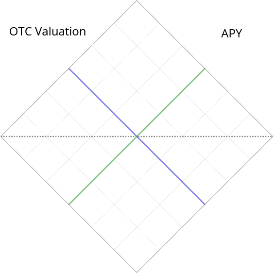
The foundation of the diamond is a two dimension scatterplot graph, designed as follows:
- One axis uses OTC’s valuations as a measure of performance. The range of this axis is from $0 to the player with the highest OTC valuation at his position.
- The other axis uses APY as a measure of compensation. The range of this axis is from the veteran minimum APY for a rookie at this position to the highest paid player at the position by APY.
- Therefore, the midlines in the chart, marked blue for OTC valuation and green for APY, represent the averages of each measure
- The dotted horizontal line, spanning from corner to corner, represents the equilibrium of the averages, where one would expect a player’s APY to match his OTC valuation.
However, as you may have already surmised with some basic knowledge of NFL contracts, using averages would be a poor overall measure. This is because the grand majority of NFL players are on rookie contracts that are greatly reduced in value as opposed to their peers on vested veteran contracts.
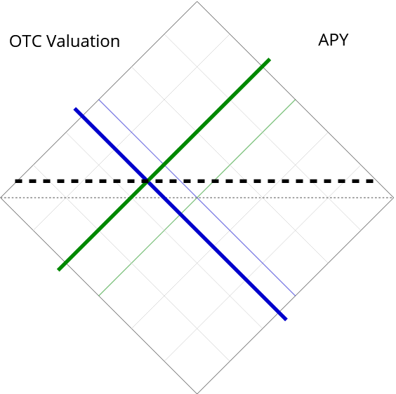
Therefore, the diamond will only faintly display these average lines, and instead more prominently display starter quality median lines, as shown to the left.
Note that these lines do not represent the overall median of the position, as that too is disproportionate. Instead, the lines represent what the median player is valued as/earning among his peers as “starters” at the position.
For example, there are 32 starting quarterbacks at any given point in an NFL season. Therefore, the quarterbacks who respectively rank 16th and 17th in OTC valuation (in blue) and APY (in green) will be plotted on or near these median lines.
Also intersecting these starter quality median lines is a dotted median equilibrium line, where anticipated performance via OTC valuation would meet the player’s APY. Think of this line as value over (or under) starter caliber APY.
Median starters, by each position
The number of “starters” that the diamond uses to establish median performance and compensation is explained in the table below. These numbers are adjusted to account for the fact that teams are increasingly using more than two wide receivers on offense at the expense of running backs or fullbacks, and more than two cornerbacks on defense at the expense of the interior defensive line or traditional linebackers.
| Quarterback | 1 | Interior Defensive Line | 2.5 |
| Running back | 1 | Edge Rusher | 2 |
| Fullback | 0.5 | Traditional Linebacker | 2 |
| Wide Receiver | 2.5 | Safety | 2 |
| Tight End | 1 | Cornerback | 2.5 |
| Tackle | 2 | Kicker | 1 |
| Guard | 2 | Punter | 1 |
| Center | 1 |
Understanding the diamond’s quadrants
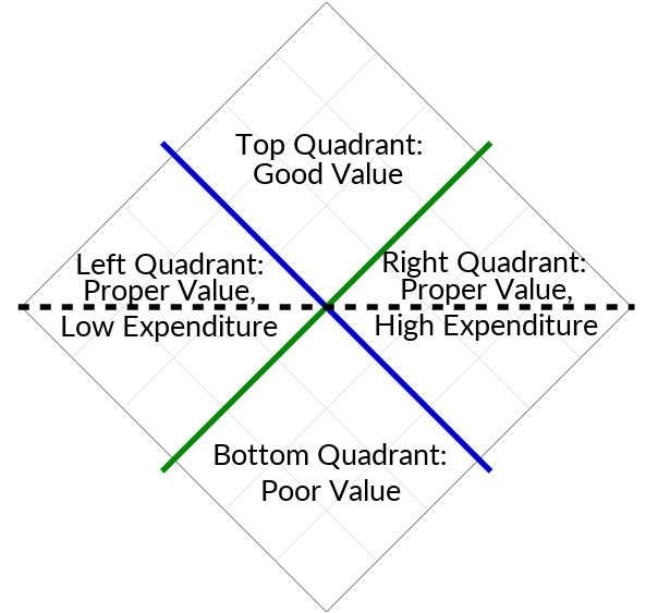
The two intersecting median lines create four quadrants on the diamond. as shown in the image to the right. Each of these quadrants loosely demonstrates a player’s performance with respect to his APY.
Top Quadrant: Good Value
Players in this quadrant are performing at a higher value than the median starter, while at the same time being compensated lower than the median starter. The overwhelming majority of players in this quadrant are young stars that are on rookie contracts. These players should expect to soon sign lucrative veteran contracts via extensions, tenders, or unrestricted free agency.
Left Quadrant: Proper Value, Low Expenditure
Players in this quadrant are closely matched with low performance but low compensation. The grand majority of players in the NFL reside in this quadrant. These are players that are typically well-understood as backups, either on rookie contracts or inexpensive veteran contracts.
Right Quadrant: Proper Value, High Expenditure
Players in this quadrant are closely matched with high performance but high compensation. Most of these players are the veteran stars of the league who have secured their lucrative veteran contract. Teams may be paying a lot for these players, but for the most part they are getting their money’s worth.
Bottom Quadrant: Poor Value
Players in this quadrant are performing at a lower value than the median starter, while at the same time being compensated higher than the median starter. While there are possible mitigating factors to note with players in this quadrant (more on this in a moment), these players may have their contracts scrutinized, with the possibility of being cut in the near future.
Adjusting for injury
As mentioned, there are mitigating factors that may undervalue a player with respect to his regular OTC valuation. By far, the most important mitigating factor is injury. Value lost to injury cannot be completely discounted, as by definition a player that misses time to injury is unable to contribute value to the team on the field. However, in most cases the injury may not be seen as permanently damaging to a player’s value. The injured player in question may have been playing at a high level before or after the injury occurred.
Therefore, the diamond will include information on injury adjusted data, both for OTC Valuation and for APY. These adjustments are calculated as follows:
- Injury Adjusted Value: [OTC Valuation]+[Average of weekly OTC Valuations for games played]*[games lost to injury]/16
- Injury Adjusted APY: [APY]-[APY]*[games lost to injury]/16.
In simpler words, the injury adjusted data adds an estimate of the hypothetical value the player would have contributed in games missed to injury, while also subtracting from the APY the games the player missed.
For an example, let’s take a look at the diamond for quarterbacks in 2019, with particular emphasis on Drew Brees and Matt Stafford. The diamond on the left displays regular data points, while the diamond on the right displays injury adjusted data points.
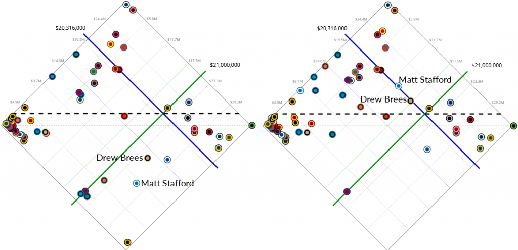
As you can see, by regular value and APY Brees and Stafford did not contribute as much as hoped by their teams. But both quarterbacks performed quite well when they were not injured, as noted by their weekly valuations when healthy. The adjustment for injury takes Brees and Stafford out of the bottom quadrant, and places them on the fringe of the top quadrant.
Also note that the injury adjustment almost vacates the bottom quadrant, moving out other injured quarterbacks like Ben Roethlisberger, Joe Flacco, Cam Newton, and Nick Foles, leaving behind only Jacoby Brissett, who missed only one game due to injury.
Where to find the diamond
Every player now has a Valuation tab on his page. Included within this tab is a diamond that plots out his contribution and compensation relative to his position, both in regular and injury adjusted terms.
The team-based diamond is visible to the public at this location. This page is interactive: you may filter by as many teams as you want, and toggle between regular and injury adjusted data. To see the same page, but with individual players instead of teams, you may find it in OTC’s premium section.